Saturday, October 31, 2009
VISC: after effects
I'm pretty sure After Effects does not want to become friends with me. Time to change that!
Monday, October 26, 2009
TYPE I : New font: Palatino
Information from Keri's blog:
02) Hermann Zapf, the designer of Palatino, was born November 8, 1918
and is currently 90 years old.
03) Palatino was initially released in 1948 by the Linotype foundry.
04) It falls into the Old Style classification of fonts.
05) Old style, or Gerald, classified fonts were initially based upon handwriting. This style is considered to be warm or friendly because of its roots in humanism. It is characterized by its slight diagonal stress. It also uses scooped serifs, also known as cove or bracketed serifs. Its x-height is also considered shorter then other typeface classifications. Old Style also has a contrast between the thick and thin lines are pronounced.
06) Other fonts that use Old Style classifications are Caslon,
Garamond, and Jenson.
07) In 1948, several major events happened that affected the whole world. The activist Mahatma Gandhi was assassinated on January 30th. The first monkey astronaut, Albert I, is launched into space from White Sands, New Mexico, on June 11th. In November, Harry S. Truman was elected as the 33rd President of the United States. It was just 3 years after the end of WWII and the whole world was rebuilding and reforming.
08) Other fonts that Hermann Zapf created include Optima, Zapfino, and Aldus.
09) Hermann Zapf is known for his creation of Palatino and Optima. He is also known for his work in redesigning many fonts to be digitized. He was born in Nuremburg and started his career in 1934 as a retoucher at Karl Ulrich & Co, printers. He started his apprenticeship there because the political climate of the time did not allow for him to attend the local Institute of Technology. In fact he had to interview with many company before being offered a job as a retoucher, this being because the company was the only one that did not ask him any political questions during the interview. In 1935 he began teaching himself calligraphy, in response to a local exhibit in honor of typographer Rudolf Koch. From there he started his way into the world of typography. However, his career was put on hold by the war, where he was trained as cartographer, after failing during basic training for the army. He was even held by the French as a prisoner of war, he was eventually sent home due to his poor health. After the war, Hermann Zapf was employed from 1947 in the typographical division of the Stempel type foundry. It was here that Zapf created Palatino, Optima, and Sistina, in1948, 1958, and 1951 respectively. From 1957 to 1974, Zapf worked as an adviser to the Linotype Company. Most of his work as a graphic artist was in book design, working from his talent in typography.
Palatino was named after a calligrapher in the 16th century named Giambattista Palatino. As such the font was based on the calligraphy pens used during the Italian Renaissance. It is consider one of the most used typeface available, and it has been translated into many medias, digital and otherwise. It is also one of the most copied, Book Antiqua being the most notable “copy” having been shipped with Microsoft Office. There are subtle differences, but in general it is nearly impossible to see the difference. Microsoft later shipped a version called Palatino Linotype, in response to those claiming Book Antigua origins. They are currently both on the latest versions of windows. Since its initial creation in the 40’s, Zapf has worked with other typographers to create variations on the original typeface. In 2005, Zapf worked with Akira Kobayashi to create a redesigned version of the original, called Palatino Nova. This Palatino nova typeface family includes roman and italics in the light, text, medium, and bold weights, a titling face formerly called Michelangelo Titling, and a large and small capital face called Palatino nova Imperial formerly called Sistina. It was released on his 87th birthday. Another version created by the pair was Palatino Sans, a sans serif form of the type face.
10) “I have designed many alphabets, including Arabic, Cyrillic, Greek, Scripts, Zapfino, the Zapf Dingbats etc. etc., but my favorite typefaces are Palatino, Optima and Melior. Unfortunately Palatino holds worldwide this sad record to be the most copied typeface. Don't use Palatino or other designs offered cheap under obscure names or as similar designs. Take the authentic original designs which you can get only from Linotype GmbH.”
Hermann Zapf
http://www.linotype.com/645/hermannzapf.html
http://www.art-directory.info/design/hermann-zapf-1918/
http://www.linotype.com/1317/palatino-family.html#
www.creativepro.com/story/feature/23728
Characteristics that I found in Palatino:


The font that I am using for the second project is Palatino. The designer is Herman Zapf and he was born on November 8, 1918. Palatino was initially released in 1948 by the Linotype foundry. The classification of this font is Old Style. This specific style is warm and friendly because it originally comes from humanism. It also has a slight diagonal stress and uses scooped serifs, which are known as cove/bracket serifs. When looking at different fonts, the x-height of Palatino is significantly smaller. The old style font shows a large contrast between thick and thin lines.
The font that I am using for the second project is Palatino. The designer is Herman Zapf and he was born on November 8, 1918. Palatino was initially released in 1948 by the Linotype foundry. The classification of this font is Old Style. This specific style is warm and friendly because it originally comes from humanism. It also has a slight diagonal stress and uses scooped serifs, which are known as cove/bracket serifs. When looking at different fonts, the x-height of Palatino is significantly smaller. The old style font shows a large contrast between thick and thin lines.
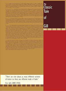
This font is definitely different from Gill Sans, the font that I had for the second project.
First off, all of the letters have serifs on them along with the numbers.
The lower case 'a' is a double story and has both a flat finial, perpendicular to the base line and terminal that is parallel to the base line.
The capital 'A' has different stroke widths on the sides and is bracketed at the bottom of it. The apex is flat.
The counter of the 'c' is not perfectly circular and the finial of the 'c' is perpendicular to the base line. the bottom end of the 'c' curves slightly upward. The barb of the letter is flat.
The ascender of the lowercase letters 'd' and 'b' are slightly angled downward towards the left. This goes the same for the letter 't', 'i', 'j', 'l', and 't'.
The eye of the 'e' is a perfect semi-circle. The cross bar is parallel to the base line.
The lowercase 'f' has a cross bar that angled/ sliced at an upward and as it crosses through the stem it continues its angle.
The capital 'G' has no spur and the serif is perpendicular to the pointed barb on top.
The lowercase 'g' is a double story with a closed loop, just like Gill Sans was. The ear of the letter is straight.
The crotch of the 'K' and 'k' meets directly at the stem of the letter and it looks as if the leg and the arm are proportional to one another.
The 'M' has a middle point that reaches all the way to the base line and is flush even with both of the legs when it comes to length. The same goes for the lowercase 'm'.
The 'O' does not have a perfect circular counter, but more of an oval shape to it. The thickness of the weight also changes and it begins to thicken up the farther out sideways when moving around the letter.
The tail of the 'Q' is mildly angled down to the right and it does not go through the circular part and into the middle of the letter. The tail goes below the base line and never above it.
The leg of the capital 'R' is completely straight and it does not connect to the stem. The crotch is just a little bit out to the right of the stem and connects to the rounded part of the letter.
The lowercase 'r' has a finial that is flat.
The cross bar of the lowercase 't' is up higher than directly in the middle of the stem of the letter.
The capital 'U' does not have a terminal at all but the lowercase letter does.
Both the 'V' and the 'W' have flat vertexes and the middle point of the 'W' is the same height as the legs of the letter.
The 'X' has a smaller x-height than most fonts and is more narrow than usual.
The capital 'Y' is a 'v' with a stem attached directly in the center below it. The lowercase letter has a curved descender and connects right at the base line to the stem of the letter.
The '@' sign changes weights just as the 'A' and the 'O' do.
The '&' sign is slightly angled a bit and has a sharp, cut off terminal and serifed endpoint.
The '*' has flat ends and a perfect circular middle.
This font definitely has a lot of different characteristics from the Sans serif font, Gill Sans, that I researched on the last project.
Wednesday, October 21, 2009
VISC: Roarrrrrr.
I'm redoing my whole concept for my animation. This is the third time I thought of a different idea and started over. Hopefully I'll be After Effects savvy by the end of this project and know it better than I know my name. Oh man...


Tuesday, October 13, 2009

Wednesday, October 7, 2009
VISC: After effects.... oh man.
I HAVE NO CLUE how to use this software. I'm a little bit nervous to begin working in After Effects and create an animation. I have never done anything like this before, but I hope I catch on quickly. I also need to come up with a creative way to do this animation. That is going to be a challenge...


Monday, October 5, 2009
TYPE I: project 2 blog
I am not very confident with the way that my designs came out, especially with the amount of time that it took to get all of them done. The color palette that I used did help tie the entire piece together. I think that when looking at everyone's in class I will get a better idea of how to create and layout these posters.
Sunday, October 4, 2009
VISC: post 10/4/09
I don't like blogging at all. But I am ready to start this new project and create my process book. The process book, in my opinion is a lot more fun and and interesting to me. I'm pretty excited to see what it looks like when finished.
Subscribe to:
Posts (Atom)
