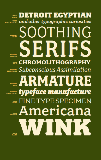
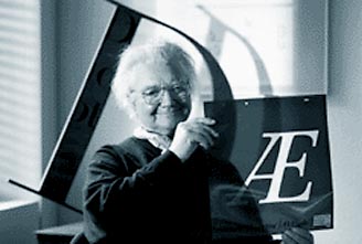
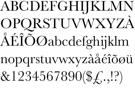
Hoefler and Frere-Jones was established in New York, New York. Jonathan Hoefler and Tobias Frere-Jones, in 2004, created their foundry even though their typographic symbols have been in the making for many decades. These two designers were like twins and were born six days apart and both fell in love with typefaces before they turned twenty. Hoefler is a self taught designer who first worked with the editorial designer Roger Black, the establisher of Font Bureau. In 1989 Hoefler created is own type foundry. Frere-Jones graduated from Rhode Island School of Design in 1992 and right after that he joined the Font Bureau, where he stayed for seven years. He designed many typefaces such as Interstate which was based on the U.S. Federal Highway Administration. Five years later he joined Hoefler and they began their partnership. Together they were given contract runs with Sports Illustrated GQ, Martha Stewart Living and Champion. They also worked with Gotham and Archer. Hoefler and Frere-Jones' work is quite contemporary and very interesting to look at. The fact that their work seems to be displayed all over the nation and attracts the viewers eye, such as mine, was one reason I chose to write about them and their foundry.
Wednesday, September 16, 2009
TYPE I: Representatives of Letterforms: Hoefler & Frere-Jones
http://www.typography.com/fonts/font_overview.php?productLineID=100008


Hoefler and Frere-Jones was established in New York, New York. Jonathan Hoefler and Tobias Frere-Jones, in 2004, created their foundry even though their typographic symbols have been in the making for many decades. These two designers were like twins and were born six days apart and both fell in love with typefaces before they turned twenty. Hoefler is a self taught designer who first worked with the editorial designer Roger Black, the establisher of Font Bureau. In 1989 Hoefler created is own type foundry. Frere-Jones graduated from Rhode Island School of Design in 1992 and right after that he joined the Font Bureau, where he stayed for seven years. He designed many typefaces such as Interstate which was based on the U.S. Federal Highway Administration. Five years later he joined Hoefler and they began their partnership. Together they were given contract runs with Sports Illustrated GQ, Martha Stewart Living and Champion. They also worked with Gotham and Archer. Hoefler and Frere-Jones' work is quite contemporary and very interesting to look at. The fact that their work seems to be displayed all over the nation and attracts the viewers eye, such as mine, was one reason I chose to write about them and their foundry.
TYPE I: Representatives of Letterforms: P22 Type Foundry
http://www.planet-typography.com/news/designer/kegler.html


"The name P22 has no known significance. It was a found object (a rubber stamp in a sans serif with just “P22”) The name was applied to several art/commerce projects in college and grad school." This style of typeface has many different artist that fall underneath it. It was established in Buffalo, New York in 1994 and has soared since then. It began as a project by Richard Kegler on the famous artist, Marcel Duchamps. He was working to digitalize Marcel's handwriting into the first official typeface of P22. The foundry, Carima El-Behairy, founded by Richard and his wife has worked with museums who have decided to revive the handwriting's of many artists such as Cezanne, Leonardo de Vinci, Gauguin. He has also worked to revive particular art periods such as Art Deco, Arts and Crafts, Art Nouveau, Pop Art and Futurism. The 'goods', which consist of mugs, playing cards and coasters are sold in museum gift shops.. The Foundry is the 'umbrella for International House of Fonts which started in 2001 and licenses original type designs. What I found interesting about this typeface is that it is used on small objects and distributed all over the nation/world in an interesting and intriguing way rather than plain typefaces that are simply just typefaces for people to purchase and use for something of their own.
TYPE I: Representatives of Letterforms: Emigre Fonts, Zuzana Licko
http://www.identifont.com/show?1I2


Zuzana Licko was born in Bratislava, Czexhoslovakia and went to school at the University of California at Berkeley. She had no formal training in the design of typeface and had done nothing with digitally produced and designed typefaces. She had no idea about the "rules of the trade" but went ahead and created uniquely designed bitmaps along side of the introduction to Macintosh in 1984 and the publication of Emigre. She created very innovated designs such as Universal, Oakland, Emperor and Emigre. These designs slowly helped to form and render more traditional designs such as Triplex, Citizen, Senator and Matrix. In the early 1990's the designs done by Zuzana were not only constrained to technology but ventured out and became more malleable and scalable. She is known for taking Baskerville and Bodoni and designing typefaces that were modern revivals of them. She ended up with thirty very diverse and daring typefaces such as Solex, Tarzana, Totally Gothic, totally Glyphic and Hypnopeadia. Her work caught my eye because it was very orderly, yet at the same time very different from that of which I am used to seeing. I especially favor her Matrix typeface, created in 2007.

Zuzana Licko was born in Bratislava, Czexhoslovakia and went to school at the University of California at Berkeley. She had no formal training in the design of typeface and had done nothing with digitally produced and designed typefaces. She had no idea about the "rules of the trade" but went ahead and created uniquely designed bitmaps along side of the introduction to Macintosh in 1984 and the publication of Emigre. She created very innovated designs such as Universal, Oakland, Emperor and Emigre. These designs slowly helped to form and render more traditional designs such as Triplex, Citizen, Senator and Matrix. In the early 1990's the designs done by Zuzana were not only constrained to technology but ventured out and became more malleable and scalable. She is known for taking Baskerville and Bodoni and designing typefaces that were modern revivals of them. She ended up with thirty very diverse and daring typefaces such as Solex, Tarzana, Totally Gothic, totally Glyphic and Hypnopeadia. Her work caught my eye because it was very orderly, yet at the same time very different from that of which I am used to seeing. I especially favor her Matrix typeface, created in 2007.
Tuesday, September 8, 2009
VISC: Visc Con. 2nd Critique Blog
After looking at the different sketches that each person had I definitely have a better understanding of what I need to fix/work on. I saw a lot of very unique and outside of the box ideas that have helped me think of more creative ways to draw/form a lion. I figured out that I was just playing it safe and not really thinking of interesting and captivating ways to make my animal. I went home and began rummaging through the most random things I found and ended up making a lion out of corrugated cardboard for parameter 10, one out of a plastic 'Healthy Choice' container and one out of cut out non-corrugated cardboard for parameter 6, and one completely out of Kleenex for parameter 7. I plan on doing a lot more thinking about parameter 8 and 9 because I feel that those were my weakest sketches and the ones that I need to improve on the most.
Wednesday, September 2, 2009
TYPE I: Who is Adrian Frutiger? What is the Univers Grid? What makes it so unique?
Adrian Frutiger is best known as a type-designer. He was born in 1928 in Interlaken, Switzerland, and at the age of 16 "he was working as a printer’s apprentice near his home town." After this portion of his life he moved to Zurich where he studied at the Zurich School of Arts and Crafts under Professor Walter Kach. After this, Frutiger moved to Paris working at the Deberny & Peignot typfoundry. At the same time as he was working here, he began to create his own typefaces, a few that were very significant and gave him the status as one of the great type designers. He is the creator and the founder of the typeface, Univers. Univers is a sans-serif typeface with a higher x-height and was released to the public in 1957. The interesting thing about this typeface is that different variations and weights, all within the type family have been designated by the use of numbers instead of names. The univers family has 44 faces, 16 of them uniquely numbered by weight and width. Twenty of the fonts have oblique positions. What makes Univers unique is that there are is a wide variety of different faces that make it suitable to use in many different occupations. It looks a bit more modern and is just as good to use for body text as well as the title. There are 21 styles in the Univers Grid. The definition of a Univers Grid is "a chart which documents the different variations of the font based on stroke weight and kerning."
TYPE I: Who is John Baskerville? What makes Baskerville so unique?
John Baskerville was born in Worcestershire in 1706. The rest of his life was spent in Birmingham. At the age of 17 he was beginning his career in typography by engraving tombstones. John was forty when he seriously took up the business for which he is known for today. The masterpiece, the Holy Bible of 1763, is known to many as the finest book printed in English. He was known to break tradition and start his own. Before Baskerville was created, the Standard English type of the early 18th century was Caslon. This was considered a tradition which started all the way back to Aldus Manutius from the 15th century. John is known for improving existing types, producing clearer, blacker type than anyone else and improving ink and presses. After four years' work, he created the first of the elegant Baskerville fonts. His type was constantly criticized because his lines were very thin strokes. It was said that his work would 'blind the eye.' His type was considered a failure and was not revived until the 20th century. John was considered to be the greatest printer of England. What makes Baskerville so unique is the curved strokes and more circular shape of the letters, making the characters became more regular. All of this created a greater consistency in size and form.
VISC: Lion.
I feel like I definitely need to be more creative and think of more 'abstract' ways to do my sketches. I'm going to work on spending more time and putting in more detail as I redo my lion sketches for Thursday.
Subscribe to:
Posts (Atom)