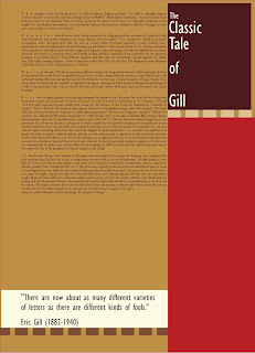
The font that I am using for the second project is Palatino. The designer is Herman Zapf and he was born on November 8, 1918. Palatino was initially released in 1948 by the Linotype foundry. The classification of this font is Old Style. This specific style is warm and friendly because it originally comes from humanism. It also has a slight diagonal stress and uses scooped serifs, which are known as cove/bracket serifs. When looking at different fonts, the x-height of Palatino is significantly smaller. The old style font shows a large contrast between thick and thin lines.
This font is definitely different from Gill Sans, the font that I had for the second project.
First off, all of the letters have serifs on them along with the numbers.
The lower case 'a' is a double story and has both a flat finial, perpendicular to the base line and terminal that is parallel to the base line.
The capital 'A' has different stroke widths on the sides and is bracketed at the bottom of it. The apex is flat.
The counter of the 'c' is not perfectly circular and the finial of the 'c' is perpendicular to the base line. the bottom end of the 'c' curves slightly upward. The barb of the letter is flat.
The ascender of the lowercase letters 'd' and 'b' are slightly angled downward towards the left. This goes the same for the letter 't', 'i', 'j', 'l', and 't'.
The eye of the 'e' is a perfect semi-circle. The cross bar is parallel to the base line.
The lowercase 'f' has a cross bar that angled/ sliced at an upward and as it crosses through the stem it continues its angle.
The capital 'G' has no spur and the serif is perpendicular to the pointed barb on top.
The lowercase 'g' is a double story with a closed loop, just like Gill Sans was. The ear of the letter is straight.
The crotch of the 'K' and 'k' meets directly at the stem of the letter and it looks as if the leg and the arm are proportional to one another.
The 'M' has a middle point that reaches all the way to the base line and is flush even with both of the legs when it comes to length. The same goes for the lowercase 'm'.
The 'O' does not have a perfect circular counter, but more of an oval shape to it. The thickness of the weight also changes and it begins to thicken up the farther out sideways when moving around the letter.
The tail of the 'Q' is mildly angled down to the right and it does not go through the circular part and into the middle of the letter. The tail goes below the base line and never above it.
The leg of the capital 'R' is completely straight and it does not connect to the stem. The crotch is just a little bit out to the right of the stem and connects to the rounded part of the letter.
The lowercase 'r' has a finial that is flat.
The cross bar of the lowercase 't' is up higher than directly in the middle of the stem of the letter.
The capital 'U' does not have a terminal at all but the lowercase letter does.
Both the 'V' and the 'W' have flat vertexes and the middle point of the 'W' is the same height as the legs of the letter.
The 'X' has a smaller x-height than most fonts and is more narrow than usual.
The capital 'Y' is a 'v' with a stem attached directly in the center below it. The lowercase letter has a curved descender and connects right at the base line to the stem of the letter.
The '@' sign changes weights just as the 'A' and the 'O' do.
The '&' sign is slightly angled a bit and has a sharp, cut off terminal and serifed endpoint.
The '*' has flat ends and a perfect circular middle.
This font definitely has a lot of different characteristics from the Sans serif font, Gill Sans, that I researched on the last project.