Saturday, December 12, 2009

TYPE I: The final Type project!


This is my final layout for my spread.

Saturday, November 28, 2009

TYPE I: Cult of the Ugly...

The Cult of the Ugly

Call out 1: "Ask a toad what is beauty… He will answer that it is a female with two great round eyes coming out of her little head, a large flat mouth, a yellow belly and a brown back."

Call out 2: "Or in the wake of earlier, more serious experimentation, has ugliness simply been assimilated into popular culture and become a stylish conceit?"

Call out 3: “The secret of ugliness consists not in irregularity, but in being uninteresting.”

Fallout

Call out 1: "I like to think it makes us smarter and better and it gives us great exposure."

Call out 2: "I'd much rather spend extra time deciphering dense layers of type and image than be smacked over the head with such a cliche."

Destruction of Syntax

Call out 1: He will begin by brutally destroying the syntax of his speech.”

Call out 2: “The imagination without strings, and words-in-freedom, will bring us to the essence of material.”


The Background:

Stephen Heller: Was born in 1950. He is American art director, journalist, critic, author, and editor who specializes on topics related to graphic design. Photo

Rudy VanderLans: Was born 1955, Voorburg and is a Dutch type and graphic designer and the co-founder of Emigre, an independent type foundry. Photo

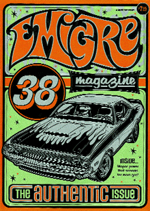
Emigre: Is a digital type foundry, publisher and distributor of graphic design related software and printed materials based in Northern California.

The Cult of the Ugly is a big deal because "Heller argued against the then-popular but now so passé style of deconstructed visuals." "In the early 1990s Steven Heller takes on the word ugly as he sees it applied to graphic design and design education. En route, his views of art history, pop culture and recent design trends are considered in his essay about style and meaning in design."


The History Part One:

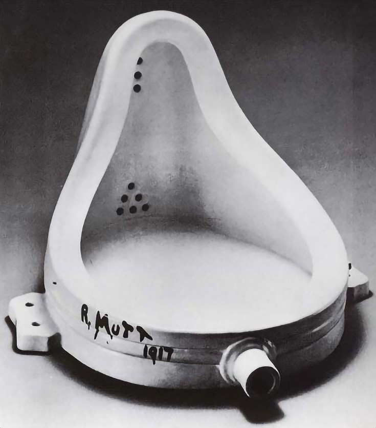
Dada: The style and techniques of a group of artists, writers, etc., of the early 20th century who exploited accidental and incongruous effects in their work and who programmatically challenged established canons of art, thought, morality, etc.

Key people in this movement: Hugo Ball, George Grosz, Sophie Täuber

Examples: One, Two, Three

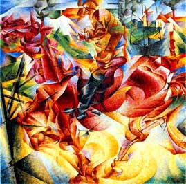
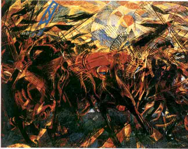
Futurists: Is a follower of futurism, esp. an artist or writer.

Key people in this movement: Filippo Tommaso Marinetti, Umberto Boccioni, Carlo Carrà, Giacomo Balla, Gino Severini

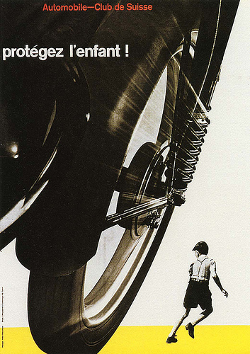
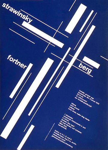
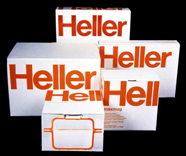
Examples of work: One, Two, Three

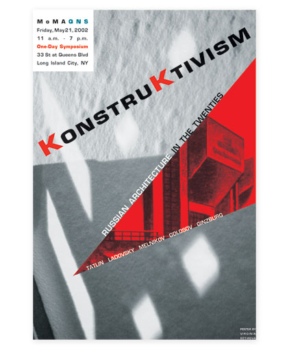
Constructivists: People who follow Constructivism. Constructivism is a nonrepresentational style of art developed by a group of Russian artists principally in the early 20th century, characterized chiefly by a severely formal organization of mass, volume, and space, and by the employment of modern industrial materials.

Key people in the movement: Kazimir Malevich, Wassily Kandinsky

Examples: One, Two, Three

Bauhaus: Pertaining to the concepts, ideas, or styles developed at the Bauhaus, characterized chiefly by an emphasis on functional design in architecture and the applied arts.

Key people in the movement: Marcel Breuer, Le Corbusier, Mies van der Rohe

Examples: One, Two, Three


The History Part Two:

English Punk: A raw expression of youth frustration manifested through shocking dress, music and art.
Swiss Design: Is a graphic design style developed in Switzerland in the 1950s that emphasizes cleanliness, readability and objectivity.
Relation to The Cult of The Ugly: This article talks about how society thinks that 'ugly' is something needed in everyday life, that it is something that is looked at as an honorable companion. "Or in the wake of earlier, more serious experimentation, has ugliness simply been assimilated into popular culture and become a stylish conceit? Swiss Punk – which in comparison with the gridlocked Swiss International Style was menacingly chaotic, though rooted in its own logic – was born in the mecca of rationalism, Basel, during the late 1970s. For the elders who were threatened (and offended) by the onslaught to criticise Swiss Punk was attacked not so much because of its appearance as because it symbolised the demise of Modernist hegemony."
Examples of Work From This Movement: One, Two, Three
Dutch Design: Dutch design is simple and powerful. "The Dutch have the ability to make fun of themselves. Also it's a matter of combining things that usually don't combine at all. Dutch designers are good in using materials that look worthless. The designers give them a new value."
New Wave: refers to an approach to typography that actively defies strict grid-based organizing conventions. Characteristics include inconsistent letterspacing, varying typeweights within single words and type set at unusual angles.
Key People in The Movement: Wolfgang Weingart and April Greiman

The Beautiful:
Paul Rand: Thinks beauty is ‘the separation of form and function, of concept and execution, in not likely to produce objects of aesthetical value." He was a well-known American graphic designer, best known for his corporate logo designs.
Massimo Vignelli: Is a designer who has done work in a number of areas ranging from package design to furniture design to public signage to showroom design through Vignelli Associates, which he co-founded with his wife, Lella. He has said, "If you can design one thing, you can design everything," and this is reflected in his broad range of work.
Armin Hoffman: Is a Swiss graphic designer. He is well known for his posters, which emphasised economical use of colour and fonts.
Willi Kunz: He was born in Switzerland and immigrated to the United States. Kunz describes his design process in this way: "Developing authentic and original ideas demands careful observation of, and response to, technological, social, and environmental changes. It also requires independent thinking that is attuned to evolving attitudes and fresh experiences rather than cursory glances through history books and design annuals."
Why is this type of work considered beautiful?
Rand: "Rand's paragraphs pack an eloquent punch on behalf of aesthetic values. . . . Even a casual observer of graphic landmarks will be rewarded by this thoroughly engaging and beautifully designed book."
Vignelli: He states. " I like design to be semantically correct, syntactically consistent, and pragmatically understandable. I like it to be visually powerful, intellectually elegant, and above all timeless."
Hoffman: "Hofmann's work is a clear and beautiful expression of the design process, at its most basic."
Kunz: "Kunz breaks down micro-aesthetic quality of letters, numbers, and punctuation; and the macro-aesthetics of typography and design elements working as a whole."

The Ugly:
"The ugly excesses – or Frankenstein’s little monsters like Output – are often exhibited in public to promulgate “the new design discourse”. In fact, they merely further the cause of ambiguity and ugliness. Since graduate school hothouses push their work into the real world, some of what is purely experimental is accepted by neophytes as a viable model, and students, being students, will inevitably misuse it. Who can blame them if their mentors are doing so, too?"

Allen Hori: Design
Jonathon Barnbrook: Poster

Summary:

The word "ugly" is applied to graphic design and design education. I feel that this article is stating that designers are intentionally making their work ugly to make a point and stand out from other designers. It is interesting to see the view of how failures should be considered moving forward in the world of design as well as those who succeed. I think that this is a different yet more positive out look. Most work is created by experiment... therefore it is most of the time ugly. The thing people are not understanding is that just because it is ugly does not mean that it is not good. There are many different movements that can be considered as movements that provide and demonstrate ugliness. These include the Futurists, where the viewer need to accept non-traditional formats, which sometimes result in confusion. Then there is the English Punk, which expresses raw expression of youth frustration manifested through crazy dressing, music and art. This movement bounces off of the Dada and Futurist movement. What is also considered to be ugly is the Swiss Punk. It was noticed and 'attacked' because not only of its appearance but 'because of symbolized the demise of Modernist hegemony." This shows how those designers who wished to make their work ugly are getting the attention and focus that they want from the viewer. It is just another way to approach the situation, in my opinion. It is a way to create alternative standards. Basically, “Rarely has beauty been an end in itself,” wrote Paul Rand in Paul Rand: A Designer’s Art. And it is equally mistaken to treat ugliness as an end result in itself." Overall, what Heller is trying to get across is that ugliness is OK. It is actually good and used to represent cultures and ideas. People need to take into consideration that creating 'ugly' work is not for just anyone. As Heller concludes, "Ugliness as a tool, a weapon, even as a code is not a problem when it is a result of form following function. But ugliness as its own virtue – or as a knee-jerk reaction to the status quo – diminishes all design."

TYPE I: Bloggin' over break.

What are the advantages of a multiple column grid.? The more there is to the grid, the more way you can arrange the design. There are more corners and more variations in distance when using a grid with multiple columns. You can create Asymmetry and create flexible (it does not have to be a rigid structure). You also have the opportunity to use different column widths.

How many characters is optimal for a line length? words per line? The average characters in a line range between 45-75. To make this better you can use kerning to help make the words fit better. Words per line averages about 10-12 words.

Why is the baseline grid used in design? "Baseline grids are liberating, taking the hassle out of trying to figure out where to put things relative to other elements on your page."

What is a typographic river? Rivers are visually unattractive gaps appearing to run down a paragraph of text. They can occur with any spacing, though they are most noticeable with wide inter-word spaces caused by either full text justification or monospaced fonts. They happen when you do not have enough characters per line.

From the readings what does clothesline or flow line mean? A flow line is the horizontal line that appears on a layout within the text; so your eye goes through the page.

How can you incorporate white space into your designs? You can do this by by not filling the entire page with text or images and utilizing the white space.

What is type color/texture mean? This is the non-white space in the design. It is the density of text.

What is x-height, how does it effect type color? The height of a lowercase x of a given typeface. The larger the x-height, the darker the color the letter seems. Basically, the color is spread out and the ends of the letter are darker than the middle.

In justification or H&J terms what do the numbers: minimum, optimum, maximum mean? The specific amount of space between words, the minimum being at the least possible, the optimum just right and the maximum being more than what is needed.

What are some ways to indicate a new paragraph. Are there any rules? Create a first line indent, a hanging indent, tracking, running indent and create a rule under the first word.

What are some things to look out for when hyphenating text. Hyphenation doesn’t improve text legibility, so other things being equal, you should turn it off. Generally, hyphenation is necessary for justified text but not for left-aligned text, because left-aligned text will have an irregular rag no matter what.

Hyphenation is also less necessary for wider text blocks, because awkward line breaks are less likely. (Newspapers have to take hyphenation seriously because most newspaper text is set in narrow columns and justified.) Hyphenation doesn’t improve text legibility, so other things being equal, you should turn it off. Generally, hyphenation is necessary for justified text but not for left-aligned text, because left-aligned text will have an irregular rag no matter what.

Hyphenation is also less necessary for wider text blocks, because awkward line breaks are less likely. (Newspapers have to take hyphenation seriously because most newspaper text is set in narrow columns and justified.)

What is a ligature? The letters that are combined to make one letter. Example: Fi, ff

What does CMYK and RGB mean?cyan, magenta, yellow, black, the four color model of printing and its process. The RGB is an additive color model. Represents red, green, blue light is added together to reproduce a broad array of colors. Purpose is for sensing, representing, and display of color on electronic devices such as televisions and computers and photography.

What does hanging punctuation mean? It is a way of typesetting punctuation marks and bullet points, most commonly quotation marks and hyphens, so that they do not disrupt the ‘flow’ of a body of text or ‘break’ the margin of alignment. It is so called because the punctuation appears to ‘hang’ in the margin of the text, and is not incorporated into the block or column of text. It is commonly used when text is fully justified.

What is the difference between a foot mark and an apostrophe? What is the difference between an inch mark and a quote mark (smart quote)? "Foot marks and inch marks are generic symbols that look like this ' (inch) " (foot). An apostrophe and quote mark have a small circle and curve that make it present the quote or word, such as “” ‘’. The default for a foot mark and inch mark is that on the computer keyboard. To make the apostrophes and smart quotes you hit option+[ (left bracket is quote, right bracket is apostrophe). To make them go the other direction add shift."

What is a hyphen, en dash and em dashes, what are the differences and when are they used. "Hyphens are used strictly for hyphenating words or line breaks. En dashes are for amounts of time such as hourly, days or years. Em dashes are abrupt changes in thought or where a period is too strong and a comma too weak."

What are ligatures, why are they used, when are they not used, what are common ligatures? "Ligatures prevent the collision or interference of characters, particularly the extended finial of the ‘f’. and the dot of the ‘i’" They are not used in Turkish typography.

Followers