Thursday, April 29, 2010
Wednesday, April 28, 2010
I can't read chinese.
So, there is someone who keeps writing comments on my blog in chinese or japanese... not sure. BUT, I cannot read what you are saying so please stop commenting.
Monday, April 26, 2010
TYPE 2: Animation Round 1
Here is my FULL type in motion. It still needs quite a bit of work but all the text is in now. WOO.
TYPE 2: Journal 14 (the last one!)
What inspired me this semester?
I want to point out three different things that inspired me this semester.
1. The TED talks that I was both assigned to watch and those which I watched for my own pleasure were very inspiring. Each person had their own story and ideas to share and teach to millions of people. I found that there was one specific TED talk that made me think about how design can come in many ways. We did not watch this one for an assignment but I was fortunate enough to see it in Philosophy of Art and Design. Michael Pritchard's design of the Lifesaver water bottle was absolutely amazing. His designed helped so many people who were in desperate need. I have always leaned towards bringing awareness of world events and problems in my designs but after seeing Michael's talk about his design it made me want to make it a goal to one day be a designer who can have this amazing effect on people.
2. Every single one of my classmates. Whether or not I have become really close friends with everyone this year, especially this semester, in Type and Graphics I feel that I have made a connection with each person. Having a group of potential designers this great is really hard to come by and I think that the up and coming classes will look up to ours and see how close we all are with one another. I feel that everyone has inspired me in some way, shape or form this year and without classmates like these I honestly don't know how I could have improved over the past eight months and gotten to where I am today. I really do feel that our entire sophomore class (also including those who are older) is by far one of the most unique and close knit groups of people that I have seen in the 20 years I have been alive. It is awesome to know that I can come to class, work towards becoming a graphic designer and be lucky enough to be around such great people for six straight hours a day. In no way am I being sarcastic either!
3. All of the Graphic Design professors who have had to put up with me for the past year. Besides an elementary school teacher that I will never forget and who is someone who has inspired me to continue doing what I love, I can definitely say that I have never had so much fun and enjoyed having professors in college like all of you in the design department. You each have your own individual way of communicating and I am so glad that I have been able to learn, in various ways, how to become a better designer. I feel that I have been inspired by you all to continue pushing myself and trying to get better and better (even if it means pulling all nighters left and right). In the end I know that it is worth it.
Well, this whole thing probably sounds really cheesy and ridiculous but it is all true. I have not found just one thing that has inspired me this semester or this year but have been fortunate enough to have so many different people give me inspiration.
Wednesday, April 21, 2010
TYPE 2: Journal 13
Larry Lessig: I really did not like this TED talk at all. I felt that he was not very interesting to listen to and that he spoke to the audience as if they were incapable of english. The way that he placed EVERY word that he said onto the screen felt very redundant and unnecessary. Sometimes by having words heard and seen at the same time makes a strong impact but during his speech I felt that he went overboard with doing this. I did find that he made a good point about three fourths of the way through his speech about how tools of creativity are the tools of speech. This is the literacy for this generation. It is how kids speak, how they think and what kids are as they understand technologies. He stated that technology has made kids different from adults and that we cannot make kids passive but can make them pirate. But is this any good? What his point ended up being was that kids live life against the law and that this is what is corruptive. I also found that the small clips of Jesus singing 'I Will Survive' and George W. Busch were the best parts of the speech.
Tuesday, April 20, 2010
TYPE 2: Motion Piece
This is the YouTube link: Walter Cronkite. Anchoring History
Monday, April 19, 2010
TYPE 2: Journal 12
Stephan Sagmeister: Sagmeister stated that everything he does always come back to him. He said this numerous times in the eight minutes that he spoke and I think that it is a very valid and important point that he makes. It works for practically everyone in graphic design. It may come back as good or bad but it will always come back. He also stated that he has to talk himself into things and he tries to be as subjective as he can be. Debbie Millman was fairly nice and did not speak about herself but spoke about how Sagmeister is letting people know that how he got to where he is today was by taking the difficult route and that he is trying to show people that it is possible. She also mentioned that he believes that graphic designers are artists. He mentioned in his video that helping others helps him and that money does not make him happy, his dreams have no meaning, trying to look good limits his life and that everyone thinks that they are right.
Milton Glaser: Milton Glaser spoke and said that no one has the ability to know their path until it is completely over. He also mentioned that there are two different sensibilities of graphic design: 1. the business man, 2. the artist. He also mentioned that passing on gifts is a device for not killing one another and that this is what artist do for the culture. This is and intuition that he and others have. He went on talking about how teaching is something that makes him feel good and made it a point to say that not to do something to project into the future because then narcissism becomes much too great. He left with a final thought and said that if you can sustain interest in what you are doing that you are extremely fortunate. I would have to say that this is very true.
David Carson: David began by saying that the lack of training he received was what helped him and that he did what made sense to him to get to where he is today. He also believes that self indulgence is a positive term and that everyone needs to have it. He stated that you want your work to let your personality come through and you need to pull from yourself. Finally, he mentioned that during your starting point you do not want to make your design difficult to read, you do not want to make it pretty but you DO need to master interpreting it.
TYPE 2: Type in motion
This is the actual official music video for Eric Hutchinson's "Okay It's Alright With Me". It is definitely one of my favorite type in motion videos and at the same time it is a more unique and fun music video unlike the standard videos that are made for EVERY OTHER song in the world. It's a great example of simpicity being more!
Wednesday, April 14, 2010

TYPE 2: Print vs. After Effects
How do you think the audience experience will change based on the media?
I think that the viewer will be able to understand the emotion in the printed book but if they see the speech in After Effects after looking at the book I believe that the viewer will be able to understand the emotion a lot more. The motion has a lot more power and is easier to manipulate until it fits the emotion of the speech perfectly. The book shows a variation in the speaker's voice but not as much as the viewer would see in an After Effects piece.
What will the audience exprience in print?
The audience should expect to understand and see when the speaker is getting louder, saying something powerful, happy, relieved and excited. The audience should understand the scale of the type reflects the way the speaker is speaking and the length of the speech will also be easier to see since it is in a book form.
What will the audience experience in Motion?
The audience will be able to feel the power and ALL OF THE EMOTION in the speech. The different pauses and laps of time will also be defined more clearly in the motion piece. Scale can also be more dramatic in After Effects than it can be in the book so the large difference in tone, volume and power will be recognized.
What can you do in print that you can't do in motion?
You are able to show the length of the speech better in print than you are able to in motion. You are also able to segment off parts of the speech to show more easy than it would be to do in motion.
What can you do in motion (in aftereffects) that you can't do in print?
The Emotion can be shown a lot better in motion than it can be in print. You also have more flexibility when working with motion than you do with print.


Sunday, April 11, 2010
TYPE 2: Journal 11
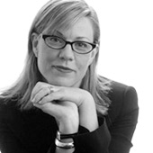 Debbie Millman
Debbie Millman "is President of the Design division at Sterling Brands, New York, host of the radio show "Design Matters" on DesignObserver.com, the Chair of the new Masters in Branding Program at the School of Visual Arts, a contributing Editor at Print Magazine, a design blogger for Fast Company and an author on the design blog Brand New. She is the President of AIGA and the author of three books: How To Think Like A Great Graphic Designer (Allworth Press, 2007), Essential Principles of Graphic Design Rotovision 2008) and Look Both Ways: Illustrated Essays on the Intersection of Life and Design."
-Debbie Millman has worked in the design business for over 25 years.
-She is President of the design division at Sterling Brands.
-She has worked on the redesign of global brands for Pepsi, Procter & Gamble, Campbell’s, Colgate, Nestle and Hasbro.
-She began hosting the first weekly radio talk show about design on the Internet.
-The show is titled “Design Matters with Debbie Millman” and it is now featured on DesignObserver.com.
Design Matters is an opinionated/provocative internet talk radio show hosted by Debbie Millman. The show combines a stimulating point of view about graphic design, branding and cultural anthropology.
He has a natural desire to draw and always knew he wanted to be an artist. He considers himself a fine artist. Inspiration has come from society and painting is the underbelly of all design. It is the natural form, according to him.
I think that Debbie Millman is a decent radio talk show host but at the same time I feel that she is kindof intimidating to the people that she is having conversations with. Although it is really difficult to hear her speak and the person she is interviewing speak, I can tell that she is really interested in finding a solution, whatever it may be and trying to dig deep into finding answers to whatever the person she is talking to is speaking about. Debbie wants to find out the personality and the process that the designers she talks to go through to get to where they are today. It seemed to me that she is struggling with finding the difference between an artist ad a graphic designer. Overall, she is interesting to hear and listen to.
GD1: Projct three... the problem.

So, overall the problem that my roommate is dealing with is one that a lot of girls... probably every girl has to deal with. It is how to organize shoes. They are cluttered, thrown, shoved, scratched and lost because there is not enough room to put them. My goal is to invent a ridiculously awesome contraption/invention/definitely not real but really cool way of making this problem go away and for my roommate to be able to have ANY SHOES she could possibly want for any time and anywhere. I just have to think of how I will do this.
TYPE 2: Journal 10
I felt that after going through the Good website I found a few decent videos and a few that were fairly boring and uninteresting to watch. The video over Your Daily Water Use was very straight forward and there was nothing exciting to it... mostly it was just facts. There was another video that was also not too strong and it was called The State of The Planet. Even though this video had a lot more detail in it, overall it felt boring and lacked uniqueness. There was one video that I found to be surprisingly interesting. It was The Hidden Cost of War. I think because the text was laid out in a new and different format and the facts/information is about something that everyone is familiar with helped this become a stronger video. Some of the info-graphics that I looked at were the same as the videos... good and bad. I found that even though the Bracketology: A March Madness Data Visualization was a topic that interest many people, overall it felt boring. Looking at it did not make me think of basketball and it really had no feeling of anything but structured lines to it. On the other hand, Fifteen Things You Should Know About Breasts was really effective because it is a topic that people are not as comfortable talking about and the visual was made to be humorous so that the viewer would feel more comfortable. I feel like the info-graphic did a goo job of both stating the facts and showing creativity.
Monday, April 5, 2010


Friday, April 2, 2010
TYPE 2: Sequence and Books and Speech
Reflecting: It is important that a sequential design must possess an overall coherence. All of the different elements such as imagery, typography, rules and color fields are put in place so that they create focal points and carry the viewers eye throughout the piece. Grids ALWAYS help make this happen! The key is to keep an element of surprise and variation. Sequences help create a visual story by considering pacing and scale of the images and text within the spreads.
Why was/is the speech important to society? This speech/report is about one of the most monumental moments from history. It covers the most amazing feat accomplished by man and inspired so many people by showing that ANYTHING IS POSSIBLE. Man walked on the moon! If that is not something absolutely amazing, then I don't know what is. This is NOT the speech is not the one everyone thinks of when they hear about the first man landing on the moon, but is a report of the event while it occurred by Walter Cronkite.
Why do you feel in is important or interesting? I feel that this speech/report is important because it not only is emotional and effects people but it is an event that happened and will never be forgotten. It is one of the most important and incredible days in the U.S.A.'s history...even the world's history. To have a man set foot on the moon is powerful and unimaginably inspiring to millions of people.
What is intonation, emphasis, what is loud, stressed, or soft. Where are there pauses... The words that are colored in the speech from Kennedy are the words that he emphasizes: "I believe that this nation should commit itself, achieving the goal, before this decade is out, of landing a man on the moon and returning him safely to earth." And when Cronkite says "What a moment. Man on the way to the moon." Throughout the entire speech/report both men are not loud, but are articulate and the feeling of relief, accomplishment and joy are heard in their voices. There is a pause right after Kennedy says "itself" and after Cronkite says "Good Morning/on the way to the moon."
Is there a call to action? When listening to it what are key/emphasized words? Goal, Moon, Safely, Armstrong, Collins, Aldrin, 6,5,4,3,2,1, liftoff, moment, stopped, adventure, distant one. These are all words that stand out when listening to the speech. They are the most important and are emphasized the most.
How does it make you feel? Honestly, this gives me goosebumps. It makes someone want to go out and achieve anything they could possibly want to do in this world. It is inspiring and extremely moving to listen to.
How do imagine that the audience felt? JUST LIKE I DID WHEN HEARING IT, but at that actual time in history... Probably 10 Million times more inspired and moved than me!
Could there be another interpretation of the speech? There have been numerous broadcasts over this event but I don't think there could ever be another Walter Cronkite. He is a legend and his voice is perfect for describing the emotion of such an important event. He is not overbearing or shouting but is serious, articulate and is a GREAT speaker and reporter.
Write/find a short bio, of the person giving the speech.
Book Design: Spreads can tell a story with sequence and variation in rhythm and scale can also add to this.
Exhibition Design: This can be a storyboard. Time can be seen throughout a story board by showing a progressive change in the events happening.
Motion: By animating type designers have to make sure that it is legible and easy to read. By shifting words from one side of the screen to another can create motion. By adjusting the timing of the words shows motion.
Type + Motion
I found that watching the 5 different short segments that Adobe created was really inspiring. The clips make it look like it is actually fairly simple to do and has me a little less nervous about starting this project not knowing a lot about After Effects. I think what is the most interesting is the way the type can be transformed, zoomed in on and altered to become extremely abstract. There is SO much that can be done with type and motion that it is unreal. Something that I would like to try to use and might make my animation more interesting and fun would be to add masks and have alternative images/text behind the main text as the Adobe example did with the bike and the vacation destination examples.
Watching Type Animation
Without Sound: This video is really hard to follow without sound. I really like the colors and the scale variation that was used because it made the words easy to see. Without sound it is hard to follow what comes next because our minds have grown accustomed to seeing and hearing at the same time.
With Sound: By watching the video with sound I was able to see which words were emphasized more and seemed to be more important. It is easier to feel the emotion in the speech and how the speaker is talking.
Without Sound: This video could actually work fairly well without sound. The text is normal every day words that people would see or hear when talking about New York. It is also at a slow enough speed to where the words can be read and not feel too jumbled and messy.
With Sound: The music goes well with all of the text and motion. Because it is not someone speaking the entire thing seems to flow a little better. The only thing I do not like about this video with sound is that it does not emphasize some of the more important words that relate to New York City. The entire piece is all at the same level.
Without Sound: I really like this type in motion because as simple as it is, it is really interesting. The way that the words related to their motion was really great. An example of this is when the word 'outcome' goes outside of the area where the text fits. Another creative approach was by using the square shape and turning it so that it created a '?'. Little things like this make the whole piece work without sound better.
With Sound: With the sound you can tell that the speaker is dragging on his words and is asking questions. I don't think you need the sound at all because for one, the speaker is almost impossible to understand.
Without Sound: This is a great video, but not without sound. It is almost impossible to follow without hearing the words go with it. The text shows the emotion without the sound, which is a positive. An example of this is the 'Argggggg'.
With Sound: This video is great with sound. Every word hits and makes an impact. The great variation in scale creates the feeling of the timid man and the angry man having a conversation perfectly. The extra shooting sound and splatters, along with the different typeface for the 'Arggggg' makes the viewer want to continue watching the video because it is so interesting and unique.
Examine/Describe/Dissemble:
Cronkite anchoring the First Moonwalk/ JFK Speech on the First Landing on the Moon
Who is speaking? President John F. Kennedy and reporter Walter Cronkite
Why was/is the speech important to society? This speech/report is about one of the most monumental moments from history. It covers the most amazing feat accomplished by man and inspired so many people by showing that ANYTHING IS POSSIBLE. Man walked on the moon! If that is not something absolutely amazing, then I don't know what is. This is NOT the speech is not the one everyone thinks of when they hear about the first man landing on the moon, but is a report of the event while it occurred by Walter Cronkite.
Why do you feel in is important or interesting? I feel that this speech/report is important because it not only is emotional and effects people but it is an event that happened and will never be forgotten. It is one of the most important and incredible days in the U.S.A.'s history...even the world's history. To have a man set foot on the moon is powerful and unimaginably inspiring to millions of people.
What is the emotion, mood, tone, personality, feeling of the speech? The emotion is overjoyed, disbelief, astonishment, inspired, exhilaration, accomplished, tears of happiness. The mood is pure happiness. The tone of this speech/report is no where near sad or depressing but happy and uplifting. The feeling that is felt when listening to this speech/report is unbelievable. It is a feeling that you have to stop, pause and think about because it is so amazing that you have to double check that IT IS REAL.
What is intonation, emphasis, what is loud, stressed, or soft. Where are there pauses... The words that are colored in the speech from Kennedy are the words that he emphasizes: "I believe that this nation should commit itself, achieving the goal, before this decade is out, of landing a man on the moon and returning him safely to earth." And when Cronkite says "What a moment. Man on the way to the moon." Throughout the entire speech/report both men are not loud, but are articulate and the feeling of relief, accomplishment and joy are heard in their voices. There is a pause right after Kennedy says "itself" and after Cronkite says "Good Morning/on the way to the moon."
What do you FEEL should be loud or soft, long pause or rued? I feel that the parts that should be loud should be where Walter Cronkite says "What a moment." and "to escape from his own planet." These words show amazement and are very powerful. I also think that when JFK says "achieving the goal" and "safely to the Earth."
Is there a call to action? When listening to it what are key/emphasized words? Goal, Moon, Safely, Armstrong, Collins, Aldrin, 6,5,4,3,2,1, liftoff, moment, stopped, adventure, distant one. These are all words that stand out when listening to the speech. They are the most important and are emphasized the most.
How does it make you feel? Honestly, this gives me goosebumps. It makes someone want to go out and achieve anything they could possibly want to do in this world. It is inspiring and extremely moving to listen to.
How do imagine that the audience felt? JUST LIKE I DID WHEN HEARING IT, but at that actual time in history... Probably 10 Million times more inspired and moved than me!
Could there be another interpretation of the speech? There have been numerous broadcasts over this event but I don't think there could ever be another Walter Cronkite. He is a legend and his voice is perfect for describing the emotion of such an important event. He is not overbearing or shouting but is serious, articulate and is a GREAT speaker and reporter.
Write/find a short bio, of the person giving the speech.
Walter Cronkite is an American journalist and he is a radio/television news broadcaster who became one of a group of outstanding correspondents and commentators for Columbia Broadcasting System (CBS) News, which was developed after World War II. He is from St. Joesph, Missouri and was an only child. He was inspired to get into journalism after reading an article in American Boy about reporters reporting all over the world. In 1950 he joined CBS News. He was unknown at this time but soon gained recognition for a lot of work he did while working at CBS. His white hair and mustache are what gave him a distinguished look.
"I built my reputation on honest, straight-forward reporting. To do anything else would be phony. I'd be selling myself and not the news."
He was the one who reported on the death of John F. Kennedy and he was known for "his undeniable enthusiasm when Neil Armstrong (1930–) became the first person on the moon in 1969." Because of how great he was at speaking to large audiences and capturing the attention of millions with his emotional speeches, at his retirement Cronkite was the most commonly mentioned person on the "dream list" for lecturers at conventions, clubs and college campuses."
He was the one who reported on the death of John F. Kennedy and he was known for "his undeniable enthusiasm when Neil Armstrong (1930–) became the first person on the moon in 1969." Because of how great he was at speaking to large audiences and capturing the attention of millions with his emotional speeches, at his retirement Cronkite was the most commonly mentioned person on the "dream list" for lecturers at conventions, clubs and college campuses."
Subscribe to:
Posts (Atom)
