Absolute Measurement: Is the measurement of fixed values expressed in finite terms These terms cannot be changed. Examples include inches and millimeters, along with picas.
Relative Measurement: Is the measurement that does not have an accurate size. Their size compares and works with the size of type that is set. An example of this is height.
Point: Is a unit of measurement used to measure the type size of a font. It is talking about the height of the type block and not the letter.
Pica: Is a 12-point type, widely used for typewriters, having 10 characters to the inch. It is an absolute measurement of 1/75 of an inch.
Em (and Em dash): Is the relative unit of measurement used in typesetting to define basic spacing functions, and therefore it is linked to the size of the type. If the type size increases, so does the size of the em. And vice versa.
En (and En dash): An en is a unit of relative measurement equal to half of one em. In 72pt type, for example, an en would be 36 points. An en rule is used to denote nested clauses, but it can also be used to mean 'to' in phrases such as 10-11.
Legibility: Is the quality of type that affects the perceptibility of a word, line, or paragraph of printed matter.
Rag: Occurs when highly noticeable shapes form by the line ends of text blocks that distract from simple, uninterrupted reading. Rags can include exaggerated slopes or noticeable inclines.
Type Alignments
Flush right : Is even or level with the right margin (flush right)
Flush left: Is the left margin (flush left) of the type page; without an indention.
Centered: Means to be set above the base line at approximately the level of the hyphen: a centered dot between syllables.
Justified: Is to to make (a line of type) a desired length by spacing the words and letters, esp. so that full lines in a column have even margins both on the left and on the right.
Advantages of type alignments- More organization, clear and easy to read, appealing
Disadvantages of type alignment- Unorganized, difficult to read, not appealing to the eye
Ideal word spacing: As the measure increases, the word spacing should increase, although less than in direct proportion to the increase in measure. The greater the leading, the greater should be the word space, again not in direct proportion. The vertical space between lines set by leading wants to be complemented by an increase in the horizontal space that word space settings determine. All caps, small caps or any type that has increased letter space looks better with additional word spacing.
Rivers: Is a vertical channel of white space resulting from the alignment in several lines of spaces between words. It is created where white space gaps align through text.
Indent: Provides the reader with an easily accessible entry point to a paragraph. The length can be related to the point size of the type such as a one em indent.
Leading: Basically, it is to guide in direction, course, action, opinion of the viewers eye.
Kerning: Is the setting of two letters closer together than is usual by removing space between them. It is the design of text faces incorporates inbuilt automatic adjustments to the spacing of particular letter pairs that would otherwise create disproportionate spaces.
Tracking: Adjusting the overall space between letters, rather than the space between two characters. It is also known as letterspacing.
Weight: Typefaces include a choice of weights, from the single bold variant common to most text faces to intermediate weights, such as book, medium, and demi: or extremes, such as black or ultra bold.
Scale: Content may be differentiated through the scale type, by increases in point size. A title or subtitle, an introductory paragraph, or pull-quote may be differentiated from the main text by being set in a larger size.
Typographic Variation: Is the variation and different techniques of typography. Some artist include: Marcel Duchamps, El Lissitzky, and Andy Warhol.
Orphan: Is the final one or two lines of a paragraph separated from the main paragraph to form a new column, and should be avoided at all costs.
Widow: Is a short last line of a paragraph, esp. one less than half of the full measure or one consisting of only a single word.
Wednesday, August 26, 2009
VISC: Reading one.
I feel like I have a better understanding about the history and importance of design but in all honesty, it was a difficult read because it was extremely informative. The fact that design has been around for hundreds of years and is still very popular today was what I gained from this reading along with knowledge about different artists, what they created, and why they are important. The part that I found the most interesting was the short article on graphic signs. The images to the left with the 'STOP' octagon and heart made it easier to understand how people interpret graphic images.
Tuesday, August 25, 2009
TYPE I: Josef Muller Brockmann


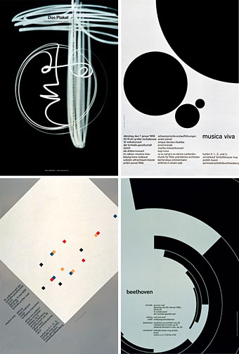
Josef Muller Brockmann was born on May 9th, 1914 in Rapperswil, Swtizerland. He began studying architecture, design and the history of art. In 1930, he first began a graphic design internship in Zurich and by 1934 was working as a freelance designer. Then, by 1936, he opened his very own studio in Zurich where he specialized in graphics. "By the 1950s he was established as the leading practitioner and theorist of the Swiss Style" of graphic design. Some if his favorite/best work was the white revers sides of posters, which he created in what he calls his 'most creative period.' This period in time was, indeed, his most creative, but at the same time it peeked to be his worst. Luckily, even though he was struggling to work through all of the obstacles he encountered he still seemed to keep his creativity and even make it into something stronger. Muller's modular grid consisted of 8-32 units offers numerous solutions and a large amount of flexibility in design. His grid could be considered "frame-work for editorial problem-solving." Each field/unit can vary in size depending on what the illustration or graphic is. This well known grid has been used all over the world all throughout the graphic and design industry. Josef was one of the most influencial and important faces in graphic design. "He taught discipline, clarity, honesty, and integrity through example." He continued working until he passed away in 1996.


Monday, August 24, 2009
TYPE I: Jan Tschichold is...


Well, to start off, Jan Tschichold has written many of his own books, which shows that he is pretty important when it comes to Typography. He was born in Leipzig, Germany, April 2nd, 1902. He was the son of a sign painter and grew up "training as a calligrapher and designer at the Leipzig Academy of Graphic Arts an
 d Book Production." from 1919 to 1921. After school, he freelanced as a lettering artist and designer. He is one of the most distinguished Typographers of this past century and is still extremely popular even though he past away in 1974. He has had great influence on the print industry and on many designers all across Europe and the United States. Tschichold was very much influenced by the unique style of Bauhaus, as well as by modern painters like László Moholy-Nagy and El Lissitzky. Jan Tschichold's The New Typography has been seen as the epitome of all books written on graphic design. Tschichold made it a point to stand out and get his ideas across and "intended to represent the rationalism of the modern age, was functional, aesthetically satisfying, and designed for reproduction by machine-type composition and newer printing technology." He is so imporant because his book became the manifesto of modern design. He was the first to bash on all font styles besides sans-serif. Tschichold was the creator of the universal alphebet and the typefaces that he created include: Transit (1931), Saskia (1931/1932), Zeus (1931), and Sabon (1966/1967). The Tschichold grid "consistes of explored subtle horizontal and vertical alignments, and used a limited range of fonts, type sizes, and type weights" (Roberts). Tschichold's work helped spread Modernist graphic design all throughout the world and is considered to be the basis of Typography.

TYPE I: The Grid.
What is a grid? "A grid is a modernist structure and uses numbers (something popular with the Bauhaus) to identify the different cuts." It breaks the space or time into regular units.
Why do designers use grids and what are the benefits/functions? The gird is used by designers with the intention to make type easier/simpler and overall, more useful. Designers use the grid to eliminate confusion that comes from different naming systems.
What is a modular grid? A modular grid has four columns and four rows. Images can take up the space of more than one modular. It has consistent horizontal division from top to bottom and vertical divisions from left to right.
Margins: Is the space around the printed or written matter on a page.
Columns: Are vertical arrangements on the page of horizontal lines of
type and are usually typographically justified.
Grid Modulars: Can be considered to be standardized units or sections for easy construction or flexible arrangement.
Flowlines: Describe the processes you need to take to get from one situation to another. They are the lines that make up the modulars.
Gutter: It is considered to be the empty space around the modulars on the grid.
Hierarchy: Is a logical and visual way to express the relative importance of different text elements by providing a visual guide to their organization. Hierarchy can be achieved by making the title the largest font and boldest on the page. "Dropping down a weight for the subtle distinguishes its subsidiarity to the title while allowing it to remain prominent.
Type Family: Is a complete set of type suitable for printing text.
Type Styles: A typeface is any full set of standardize letterforms, which include roman, italic and bold. These can be more extensive by incorporating condensed or extended in display.
Subscribe to:
Posts (Atom)