Monday, September 28, 2009

TYPE I: Identifying Characteristics

The letter 'A' has a flat apex and there are no brackets at all. The legs are straight and the crossbar is a little bit closer to the x-height than the baseline.

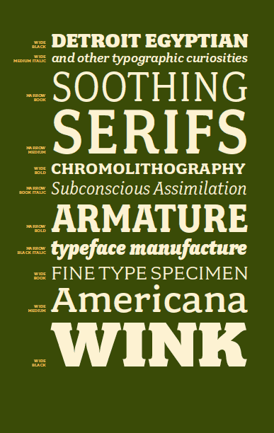
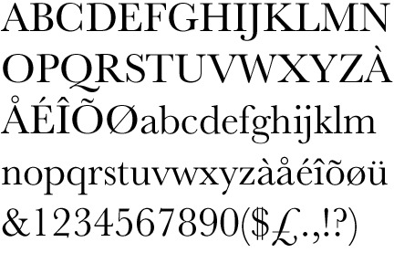
The lowercase letter 'a' is considered to be a double-storey with a plain final and plain terminal or possibly a beak stroke terminal. The bowl of the 'a' is higher than most lowercase letters of this font.

The lowercase letter 'd' has an ascender that reaches cap height and is completely flat. There is no terminal to this letter and it sits on the baseline without descending below. The counter of the letter looks like a backwards capital 'D'.

The letter 'G' does not have a spur. The bowl of the letter is at cap height.

The lowercase letter 'g' is considered to be a double-storey with a closed tail. The ear of the 'g' is flat and does not have a serif at all. The link is weaker and longer than most other fonts. The bowl is lower and the counter is a perfect circle.

The letter 'M' has two flat apexes and both terminals are obviously sans serif. The apex of the letter reaches the the cap height and does not go below the base line.

The letter 'Q' has a tail that goes below the base line and the counter is a perfect circle. The bowl of the letter reaches the cap height and goes all the way to the base line.

The lowercase letter 'x' reaches just above the x-height line and there are flat apexes and flat terminals. The counter that is formed creates an arrow like figure without the indentations. In other words it looks like for different triangles facing one another.

The letter 'R' pretty much has one straight leg and another that is slightly curved. The crotch that is created is formed by the loop and the right leg connecting to that loop, not to the left leg. There are terminals that are sans serif and no ascenders. The counter that is created forms the shape of the capital letter 'D'.

The lowercase letter 't' has a ascender that is 'roman' with a sharp and refined serif. The letter does not go below the base line and the cross bar is just right underneath the cap height.

The number 4 has a flat apex and the cross bar crosses directly in the middle of the number. The number goes all the way from the cap height down to the base line without ands serifs.

The question mark is very unique. The dot is a fully enclosed circle and the curve of the question mark kind of has a handwriting-derived tapered serif at the top of it while the end of it comes to a sharp point.

The stroke width in all of these letters when they are just normal font is normal. And when looking at all of the capitol and lowercase letters, there are no other unique letters that I can see.

Friday, September 25, 2009

TYPE I: REALLY LONG blog about Eric Sans: Gill Sans.

A B C D E F G H I J K L M N O P Q R S T U V W X Y Z

a b c d e f g h I j k l m n o p q r s t u v w x y z

1 2 3 4 5 6 7 8 9 0

! @ * & ? { }

The designer is Eric Gill. He was born 22- 2-1882 in Brighton, England and died 17-11-1940 in Uxbridge, England.

The font that Eric is known for, Gill Sans, belongs in the HUMANIST SANS SERIF classification. This can be seen when looking at the ‘a’ in the alphabet. There is a lilting counter in the letter ‘a’, and there are calligraphic variations in line weight. This classification was created in the nineteenth century, “when printers wanted to identify a heritage for their own craft analogous to that of art history.” Humanist letterforms are very closely connected to calligraphy and the movement of a person’s hand while Transitional and modern typefaces are more abstract and less organic. “This classification reveals to a careful investigation some "anti-geometric" features, such as uneven width of strokes (especially in bold variants), non-perpendicular cuts, and slightly bent off tips of strokes (e.g. the bottom of the vertical stroke in "d"). All these subtleties were intended to smooth out the too harsh edges of the generic sans serif design and improve legibility of characters, and their net result is a relatively warm and friendly-looking typeface---especially if we compare it to the apathetic Helvetica or phrenetic Futura.” Some different typefaces that fall under this classification include: Agenda Thin, Berlin Sans Demi and Comedia Medium.

During the year 1926 there were many different events and recognizable moments. Some examples of these include when Winnie-the-Pooh was published by Author A. A. Milne, along with the invention Liquid Fuel Rocket USA by Robert Goddard Aerosol Sprays Norway by Erik Rotheim, Hirohito was crowned emperor of Japan, Pontiac Cars were made, U.S. Route 66 was created running from Chicago to Los Angeles, Radio network National Broadcasting Co ( NBC ) was launched, Fidel Castro, Marilyn Monroe, and Hugh Hefner were born, and the President was Calvin Coolidge.

Some of the fonts other than Gill Sans that Eric Gill designed include: Perpetua (1929/30), Gill Sans (1927-1930), and Joanna (1930/31).

Eric was a sculptor, graphic artist and type designer. He studied at the Chichester Technical and Art School and he became a letter and stonecutter. “A devout Christian, Eric Gill converted to Catholicism in 1913. Between 1913 and 1918 Eric Gill produced fourteen reliefs with scenes for the Stations of the Cross for Westminster Cathedral in London.” “From 1924 Eric Gill designed book layouts and most of his typeface designs date from around 1930. From 1928 Eric Gill had his own printing press at Speen, Buckinghamshire.” Gill Sans was originally created in 1926 by Eric and later was released by Monotype Corporation in 1928. Gill Sans font can be seen in railways, BBC, Penguin Books, advertisements, signs and it is distributed as a system font in Mac OS X. “’ Gill was one of the chief protagonists in the movement for the revival of direct carving, and his work usually has an impressive simplicity of conception; he wrote that his "inability to draw naturalistically was, instead of a drawback, no less than my salvation. It compelled me ... to concentrate upon something other than the superficial delights of fleshly appearance ... to consider the significance of things.’ He tried to revive a religious attitude towards art and craftsmanship in opposition to the social and economic trends of the time, and in life, as in his work and writing, he was a vigorous advocate of a romanticized medievalism. His unconventional behavior was well known in his own time, but the most bizarre and unpleasant aspects of his life were not revealed until the publication of Fiona MacCarthy’s biography in 1989; he had incestuous relationships with two of his sisters and two of his daughters and sexual congress with a dog.” It was Stanley Morison who worked at Monotype who persuaded Gill to design this lettering into a typeface. The only weakness that Gill Sans has is that its weight does not work well in certain environments. The light typeface is too light for continuous text and the regular is too heavy. It is a font that is specifically modeled after roman proportions and the typeface “has a friendly warmth” to it. “The series was originally produced as hot-mail letterpress type, so when it was designed it is most likely that the original Monotype office drawings were used.” It is a font that has a very extensive range of weight, ranging from light to ultra bold with italics and Old-style figures. Gill Sans also has two display weight: Bold and extra bold, four condensed weights and two fonts used for decoration: Gill Sans Light Shadowed and a titling Gill Sans Shadowed. Gill was a very inspirational man who described himself on his gravestone as a stone carver. He stated, "The shapes of letters do not derive their beauty from any sensual or sentimental reminiscences. No one can say that the O's roundness appeals to us only because it is like that of an apple or of a girl's 
breast or of the full moon. Letters are things, not pictures of things."

My favorite quote by Eric Gill: "There are now about as many different varieties of letters as there are different kinds of fools.”

http://www.linotype.com/391/ericgill.html

http://www.ascenderfonts.com/info/gill-sans-fonts.aspx

http://www.papress.com/thinkingwithtype/letter/classification.htm

http://www.thepeoplehistory.com/1926.html

http://www.modernbritishartists.co.uk/ericgill_biog.htm

*I will post the names of the books that I researched when I can see the titles of the scans I made of them on Monday!

Wednesday, September 23, 2009

VISC: Almost finished...

I laid out the final 16 lion designs that I am going to make my poster with. So far the look pretty good and I'm hoping that after looking at everyone's tomorrow that I will know what to do before I print the final poster on the Plotter. I'm actually more excited to start working on the process book than this first project. I think that it is going to be more fun to basically, design the whole book and have it look organized and well designed. I just need to finish putting all of my scans into illustrator and InDesign so that I can be ready for beginning the process book when we finish the poster.

Sunday, September 20, 2009

TYPE I: Define Font Classification in general terms

Old Style: "Shows a marked departure from simply mimicking the handwriting of earlier Italian scholars and scribes." In this period, that you can see type getting more popular.
Examples: Calisto, Goudy Old Style

Traditional: Was formed in the late 17th century as an "improved style". Later was it named "transitional". It shares some characteristics of Venetian Old Style, yet it features stronger stroke contrast, curves and round letters with vertical stress, slightly rounded serifs.
Examples: Baskerville, Caslon, Sabina

Modern: It is a style of typeface developed in the late 18th century that continued through much of the 19th century. It has very high contrast between thick and thin strokes and flat serifs.
Examples: Bodoni, Didot, Bernhard Modern Roman

Slab Serif: It is a type of serif font that evolved from the Modern style. The serifs are square and larger, bolder than serifs of previous typestyles.
Examples: Clarendon, American Typewriter, Rockwell

Sans Serif: Is type which does not have serifs. "There are five main classifications: Grotesque, Neo-Grotesque, Geometric, Humanist, and Informal. Typefaces within each classification usually share similarities in stroke thickness, weight, and the shapes of certain letterforms."
Examples: Verdana, Futura, Univers

Script: Are connected, flowing letters resembling hand writing with pen or quill. Either slanted or upright. Sometimes with a left-hand slant.
Examples: Backadder, Edwardian Script, French Script

Blackletter: Are also known as Gothic fonts. They "are sans serif typefaces. Serifs are the cross strokes at the ends of the main strokes of a letter. Gothic fonts are relatively uniform in stroke weight."
Examples: Authentic Ink, Young Blood, Mahalia

Grunge: I am not sure but they "have subtle dirty elements, providing the content with the dominant position it deserves."
Examples: Bulliten, Film, Gritzpop

Monospaced: "A monospaced font is one in which every character takes up the same amount of horizontal space."
Examples: 1913 Typewriter, 7 Days 2003, Andale Mono

Undeclared: I could not find his font definition but I would think that it is a typeface that is not in a specific category of fonts as the others are.
Examples: I will find some.


Wednesday, September 16, 2009

TYPE I: Representatives of Letterforms: Hoefler & Frere-Jones

http://www.typography.com/fonts/font_overview.php?productLineID=100008


Hoefler and Frere-Jones was established in New York, New York. Jonathan Hoefler and Tobias Frere-Jones, in 2004, created their foundry even though their typographic symbols have been in the making for many decades. These two designers were like twins and were born six days apart and both fell in love with typefaces before they turned twenty. Hoefler is a self taught designer who first worked with the editorial designer Roger Black, the establisher of Font Bureau. In 1989 Hoefler created is own type foundry. Frere-Jones graduated from Rhode Island School of Design in 1992 and right after that he joined the Font Bureau, where he stayed for seven years. He designed many typefaces such as Interstate which was based on the U.S. Federal Highway Administration. Five years later he joined Hoefler and they began their partnership. Together they were given contract runs with Sports Illustrated GQ, Martha Stewart Living and Champion. They also worked with Gotham and Archer. Hoefler and Frere-Jones' work is quite contemporary and very interesting to look at. The fact that their work seems to be displayed all over the nation and attracts the viewers eye, such as mine, was one reason I chose to write about them and their foundry.

TYPE I: Representatives of Letterforms: P22 Type Foundry

http://www.planet-typography.com/news/designer/kegler.html


"The name P22 has no known significance. It was a found object (a rubber stamp in a sans serif with just “P22”) The name was applied to several art/commerce projects in college and grad school." This style of typeface has many different artist that fall underneath it. It was established in Buffalo, New York in 1994 and has soared since then. It began as a project by Richard Kegler on the famous artist, Marcel Duchamps. He was working to digitalize Marcel's handwriting into the first official typeface of P22. The foundry, Carima El-Behairy, founded by Richard and his wife has worked with museums who have decided to revive the handwriting's of many artists such as Cezanne, Leonardo de Vinci, Gauguin. He has also worked to revive particular art periods such as Art Deco, Arts and Crafts, Art Nouveau, Pop Art and Futurism. The 'goods', which consist of mugs, playing cards and coasters are sold in museum gift shops.. The Foundry is the 'umbrella for International House of Fonts which started in 2001 and licenses original type designs. What I found interesting about this typeface is that it is used on small objects and distributed all over the nation/world in an interesting and intriguing way rather than plain typefaces that are simply just typefaces for people to purchase and use for something of their own.

TYPE I: Representatives of Letterforms: Emigre Fonts, Zuzana Licko

http://www.identifont.com/show?1I2


Zuzana Licko was born in Bratislava, Czexhoslovakia and went to school at the University of California at Berkeley. She had no formal training in the design of typeface and had done nothing with digitally produced and designed typefaces. She had no idea about the "rules of the trade" but went ahead and created uniquely designed bitmaps along side of the introduction to Macintosh in 1984 and the publication of Emigre. She created very innovated designs such as Universal, Oakland, Emperor and Emigre. These designs slowly helped to form and render more traditional designs such as Triplex, Citizen, Senator and Matrix. In the early 1990's the designs done by Zuzana were not only constrained to technology but ventured out and became more malleable and scalable. She is known for taking Baskerville and Bodoni and designing typefaces that were modern revivals of them. She ended up with thirty very diverse and daring typefaces such as Solex, Tarzana, Totally Gothic, totally Glyphic and Hypnopeadia. Her work caught my eye because it was very orderly, yet at the same time very different from that of which I am used to seeing. I especially favor her Matrix typeface, created in 2007.

Tuesday, September 8, 2009

VISC: Visc Con. 2nd Critique Blog

After looking at the different sketches that each person had I definitely have a better understanding of what I need to fix/work on. I saw a lot of very unique and outside of the box ideas that have helped me think of more creative ways to draw/form a lion. I figured out that I was just playing it safe and not really thinking of interesting and captivating ways to make my animal. I went home and began rummaging through the most random things I found and ended up making a lion out of corrugated cardboard for parameter 10, one out of a plastic 'Healthy Choice' container and one out of cut out non-corrugated cardboard for parameter 6, and one completely out of Kleenex for parameter 7. I plan on doing a lot more thinking about parameter 8 and 9 because I feel that those were my weakest sketches and the ones that I need to improve on the most.

Wednesday, September 2, 2009

TYPE I: Who is Adrian Frutiger? What is the Univers Grid? What makes it so unique?


Adrian Frutiger is best known as a type-designer. He was born in 1928 in Interlaken, Switzerland, and at the age of 16 "he was working as a printer’s apprentice near his home town." After this portion of his life he moved to Zurich where he studied at the Zurich School of Arts and Crafts under Professor Walter Kach. After this, Frutiger moved to Paris working at the Deberny & Peignot typfoundry. At the same time as he was working here, he began to create his own typefaces, a few that were very significant and gave him the status as one of the great type designers. He is the creator and the founder of the typeface, Univers. Univers is a sans-serif typeface with a higher x-height and was released to the public in 1957. The interesting thing about this typeface is that different variations and weights, all within the type family have been designated by the use of numbers instead of names. The univers family has 44 faces, 16 of them uniquely numbered by weight and width. Twenty of the fonts have oblique positions. What makes Univers unique is that there are is a wide variety of different faces that make it suitable to use in many different occupations. It looks a bit more modern and is just as good to use for body text as well as the title. There are 21 styles in the Univers Grid. The definition of a Univers Grid is "a chart which documents the different variations of the font based on stroke weight and kerning."

TYPE I: Who is John Baskerville? What makes Baskerville so unique?


John Baskerville was born in Worcestershire in 1706. The rest of his life was spent in Birmingham. At the age of 17 he was beginning his career in typography by engraving tombstones. John was forty when he seriously took up the business for which he is known for today. The masterpiece, the Holy Bible of 1763, is known to many as the finest book printed in English. He was known to break tradition and start his own. Before Baskerville was created, the Standard English type of the early 18th century was Caslon. This was considered a tradition which started all the way back to Aldus Manutius from the 15th century. John is known for improving existing types, producing clearer, blacker type than anyone else and improving ink and presses. After four years' work, he created the first of the elegant Baskerville fonts. His type was constantly criticized because his lines were very thin strokes. It was said that his work would 'blind the eye.' His type was considered a failure and was not revived until the 20th century. John was considered to be the greatest printer of England. What makes Baskerville so unique is the curved strokes and more circular shape of the letters, making the characters became more regular. All of this created a greater consistency in size and form.

VISC: Lion.

I feel like I definitely need to be more creative and think of more 'abstract' ways to do my sketches. I'm going to work on spending more time and putting in more detail as I redo my lion sketches for Thursday.

Followers